Zerion Navigation Case Study
Overview
The Navigation redesign was one of the most impactful Zerion initiatives, aimed at unifying user experience across iOS, Android, and Browser Extension. The previous navigation concept followed the principle "Browse First, Finance Second," focusing heavily on portfolio tracking and browsing. However, as Zerion evolved into a Trading‑First product — prioritizing transactions, trading, and active user participation — the old navigation required a full rethink.
Our goal was to simplify user journeys, align mental models across all platforms, and make trading and portfolio management actions instantly accessible. Moving to a classic bottom‑navigation bar provided a familiar pattern used by most modern finance and social apps, reducing learning curves and improving flow recognition.
Problem Statement
The legacy navigation had grown organically over time, creating friction and inconsistency. From interviews, feedback, and internal statistics, we identified several major pain points:
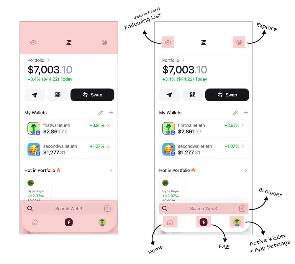
- Users didn't see top tabs like Watchlist and Explore.
- Switching between Browser and Portfolio contexts was confusing.
- Home button was unclear — users clicked it and nothing happened.
- Banners on Home didn't drive core business goals (Fee‑Generating Volume).
- Settings were buried and hard to find.
- Search wasn't available across contexts.
- Bottom bar was too large and wasted space.
- Central CTA button suffered from banner blindness — users ignored it.
- Confusing for beginners — new users didn't know where to start, what each section meant, or how to make their first trade.
In essence, the structure itself worked against both user efficiency and product metrics. Moreover, the old navigation was especially confusing for newcomers — new users struggled to understand where to start, what each section represented, and how to perform their first transaction.
Objectives
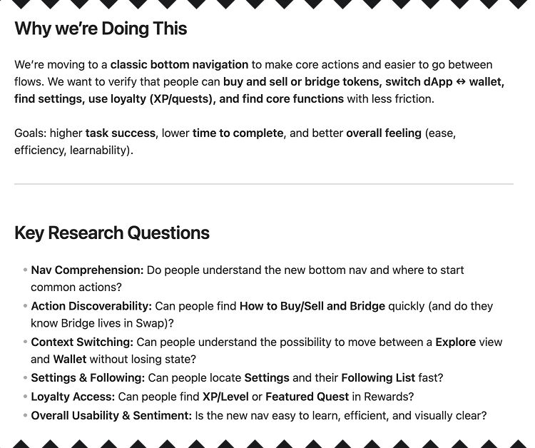
By deeply understanding users’ pain points and analyzing the data, we defined the following goals:
Reinforce Zerion's shift to Trading-First UX, making transaction and trade actions central
Create a unified navigation architecture consistent across all platforms (iOS, Android, Extension)
Reduce friction for frequent trading and asset management actions
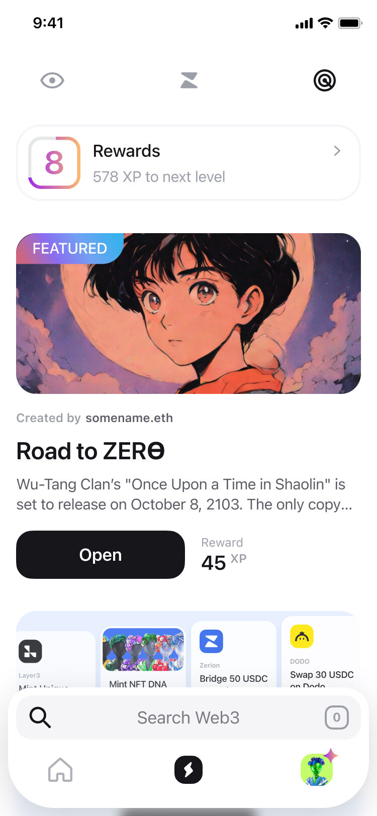
Boost discoverability of new and social features (Feed, Explore, Loyalty, etc.)
Enable scalability for future modules without UX debt
Make Zerion much more user-friendly and intuitive for new traders
Research & Insights
Our research combined three layers:
Internal Analytics
Analysis of click paths, screen transitions, and feature engagement helped us see where users most often initiated and dropped key actions. We detailed which buttons were ignored, which pages drew attention, and how users switched between contexts.
Competitive Analysis
We reviewed navigation patterns of leading Web3 and fintech products to identify familiar mental models. The strongest insight: users think in contexts first, actions second — they choose what to act on before deciding what to do.
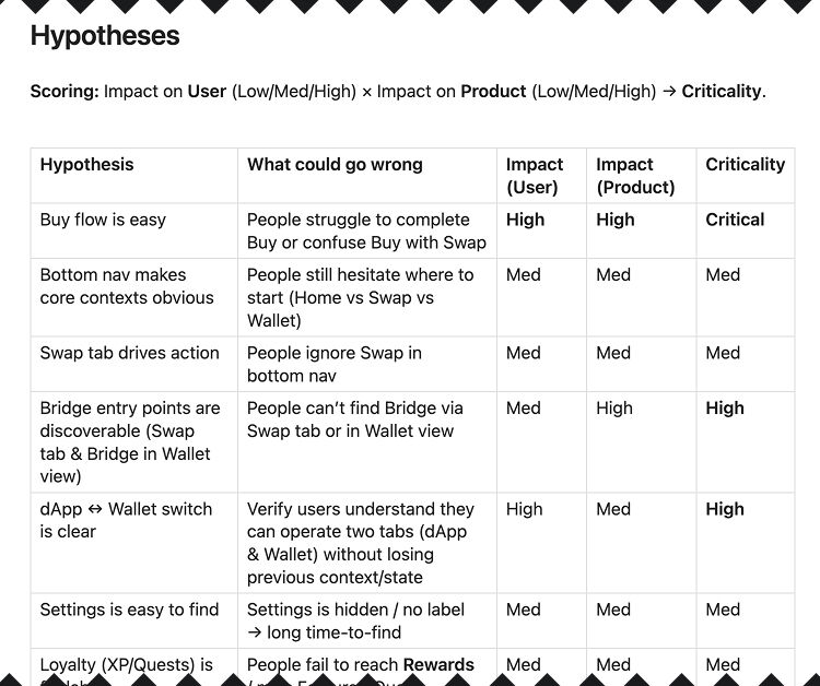
Usability Hypotheses
Derived from Maze planning sessions, focusing on five critical areas: action discoverability, context switching, settings access, loyalty visibility, and comprehension of the new navigation.
Design Process
Information Architecture
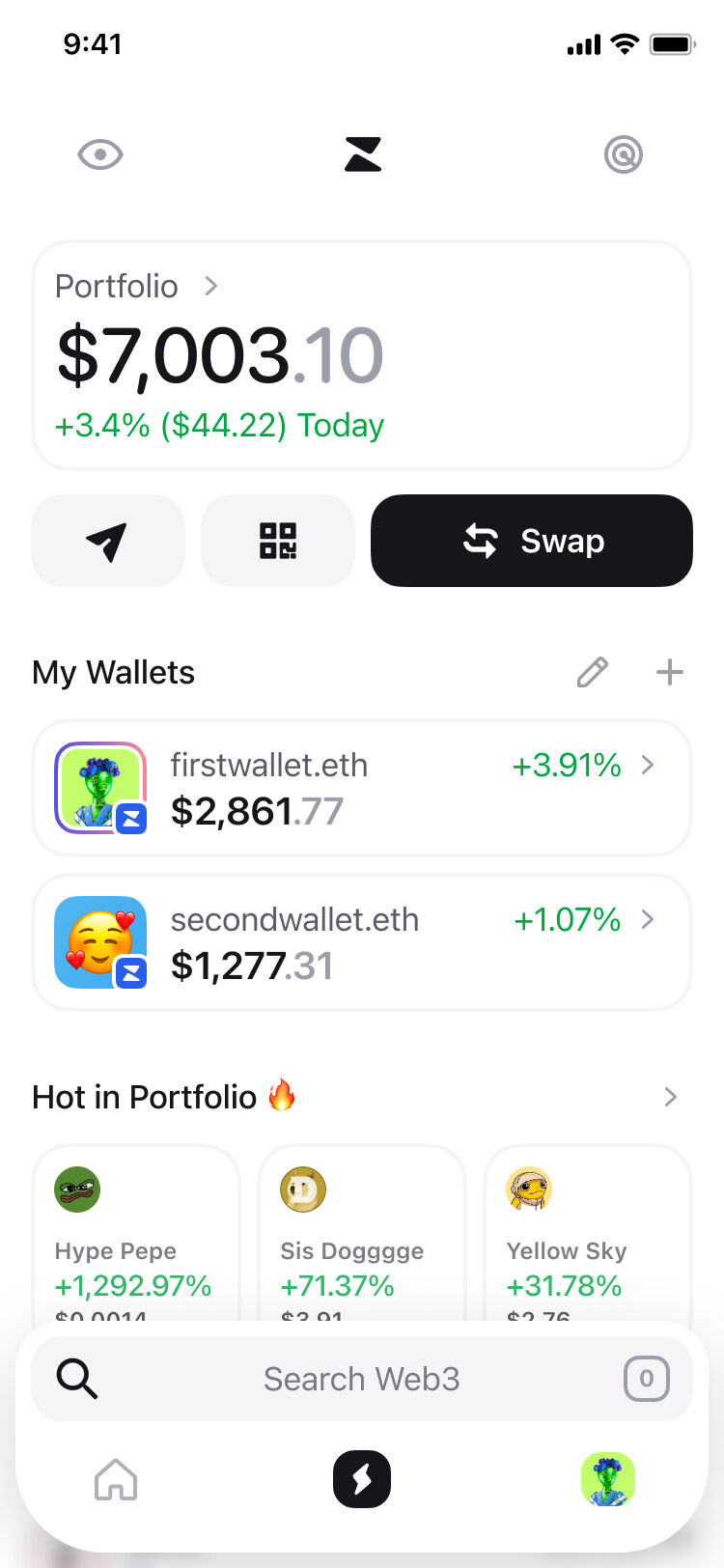
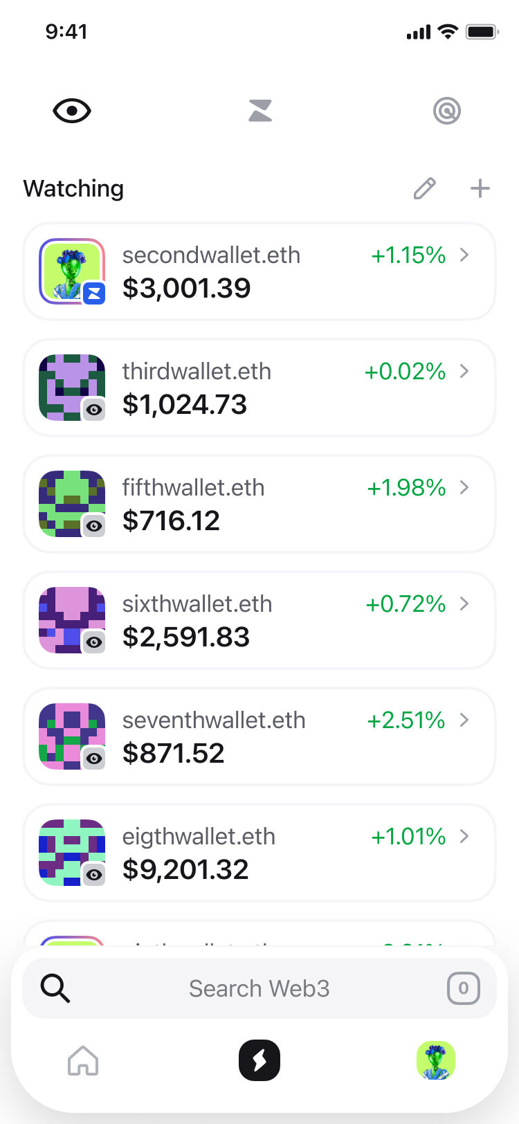
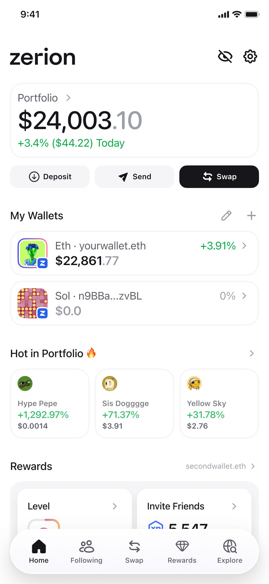
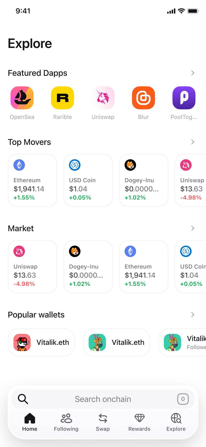
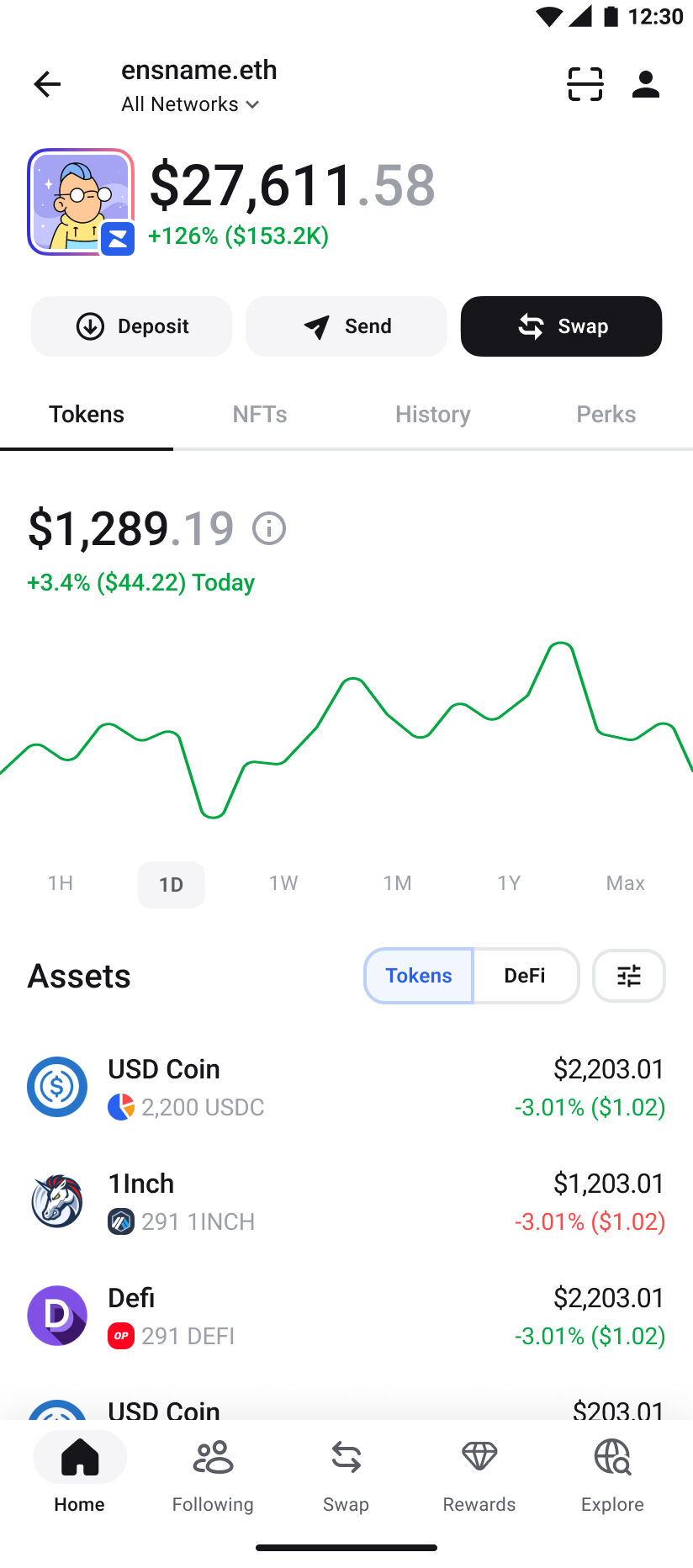
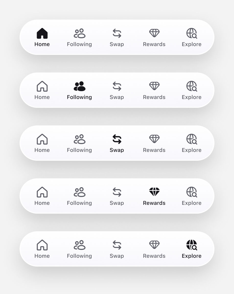
- Defined 4 top‑level contexts: Home, Following, Swap, Rewards, Explore.
- Mapped all features by intent (Check balances, Initiate actions, Access rewards, Explore new assets, and so on).
- Ensured each tab presented a single, clear action to prevent ambiguity or overlapping meanings.
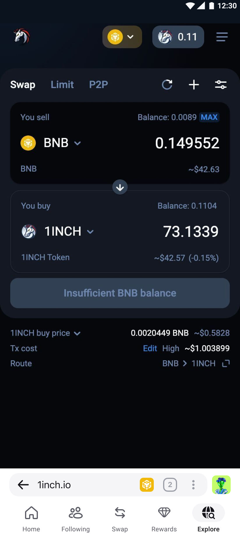
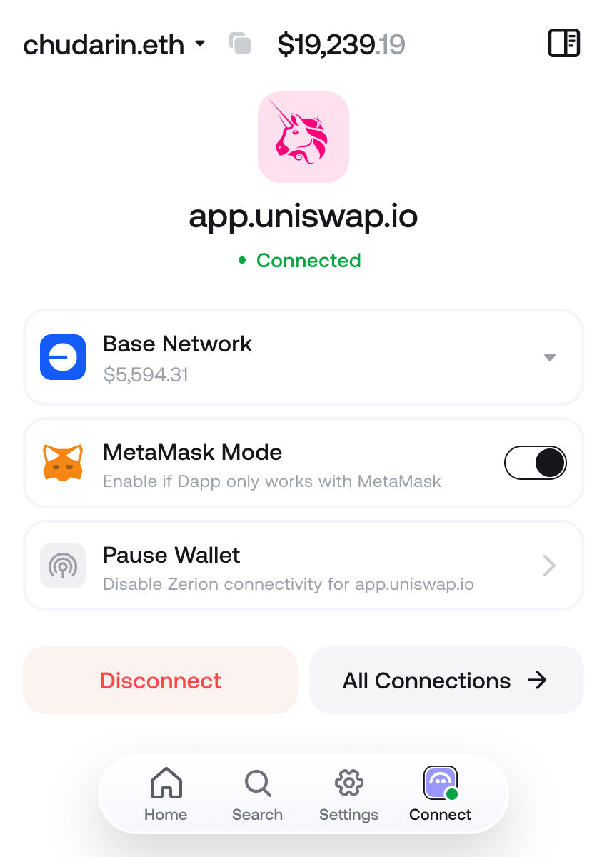
- Addressed wallet switching and account context visibility (e.g., "From Portfolio → To dApp").

Prototyping & Testing
Built a single draft prototype and validated it in three phases:
- Private pilot — to validate scenarios and surface critical issues early.
- Internal (company‑wide) — to collect broader feedback and refine copy, flows, and iconography.
- External (two waves) — first with our community of existing users, then a public wave including people who hadn't used Zerion.
Across these stages, we confirmed that a classic bottom navigation improves recognition over recall, reducing confusion between "where to act" and "what to act on."
Usability Test
We ran an unmoderated usability test with 200+ users to verify navigation clarity and task success. Participants completed tasks such as finding Bridge, switching between Wallet ↔ dApp, locating Settings, and accessing the Loyalty program.
Key results:
- 100% success rate for swap and bridge tasks.
- 99% success locating wallets and balances.
- 83% preferred the new navigation to the old version.
- Average rating: 6.5/7.
Qualitative feedback confirmed better flow comprehension and easier mental mapping between contexts.
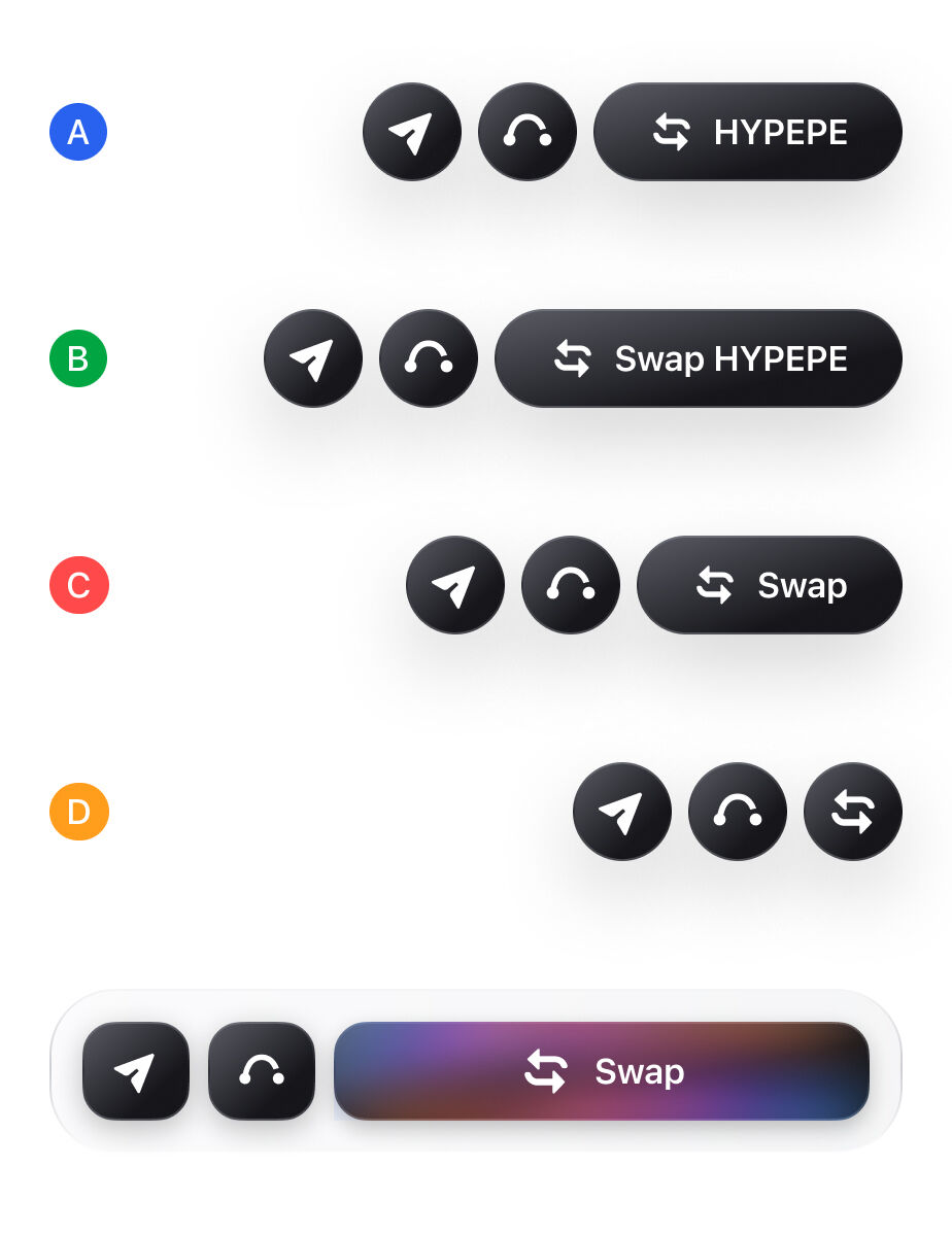
UI & System Integration
- Tested and refined the icon system, improving contrast and differentiation between selected and inactive states.
- Conducted adaptation sessions to make navigation feel native on each platform: iOS follows a more fluid, soft visual style, Android uses Material principles, and the Extension version adjusts its items to browser-specific context and functionality.
- Rollout was progressive by user percentage, gradually increasing exposure (e.g., 10% → 30% → 100%) to monitor stability and feedback.
- Prepared several A/B tests — for example, two CTA variants on the Asset Page — to validate user noticing the key actions and understanding the context.

Lessons Learned
Navigation Paradigms
Navigation
can be designed
through action‑first, context‑first, or hybrid approaches. The key lesson is to understand when each
pattern fits the mental model of users and apply them intentionally rather than uniformly.
Bold CTAs Require Restraint
Trying to
over‑emphasize a main
action can backfire — users may develop visual fatigue or ignore it altogether. Subtlety and clarity often
win over visual noise.
Data and Testing as Redesign Drivers
Continuous research,
internal pilots, and community testing became the main engine of this milestone redesign. Unlike the
earlier Browse‑First model that lacked testing, this iteration was shaped and validated through measurable
user feedback.
Cross‑team Collaboration is Critical
Navigation design
should be
coordinated not only with product and engineering but also with marketing, since it defines how features
are surfaced, promoted, and understood inside the app.
Technical Alignment Early On
Even small
navigation
adjustments
can have major implementation implications. Early synchronization with developers prevents costly rework
and ensures smooth delivery across different platforms.
"Designing navigation wasn’t just moving tabs around — it was about shaping how people recognize Zerion as a wallet."